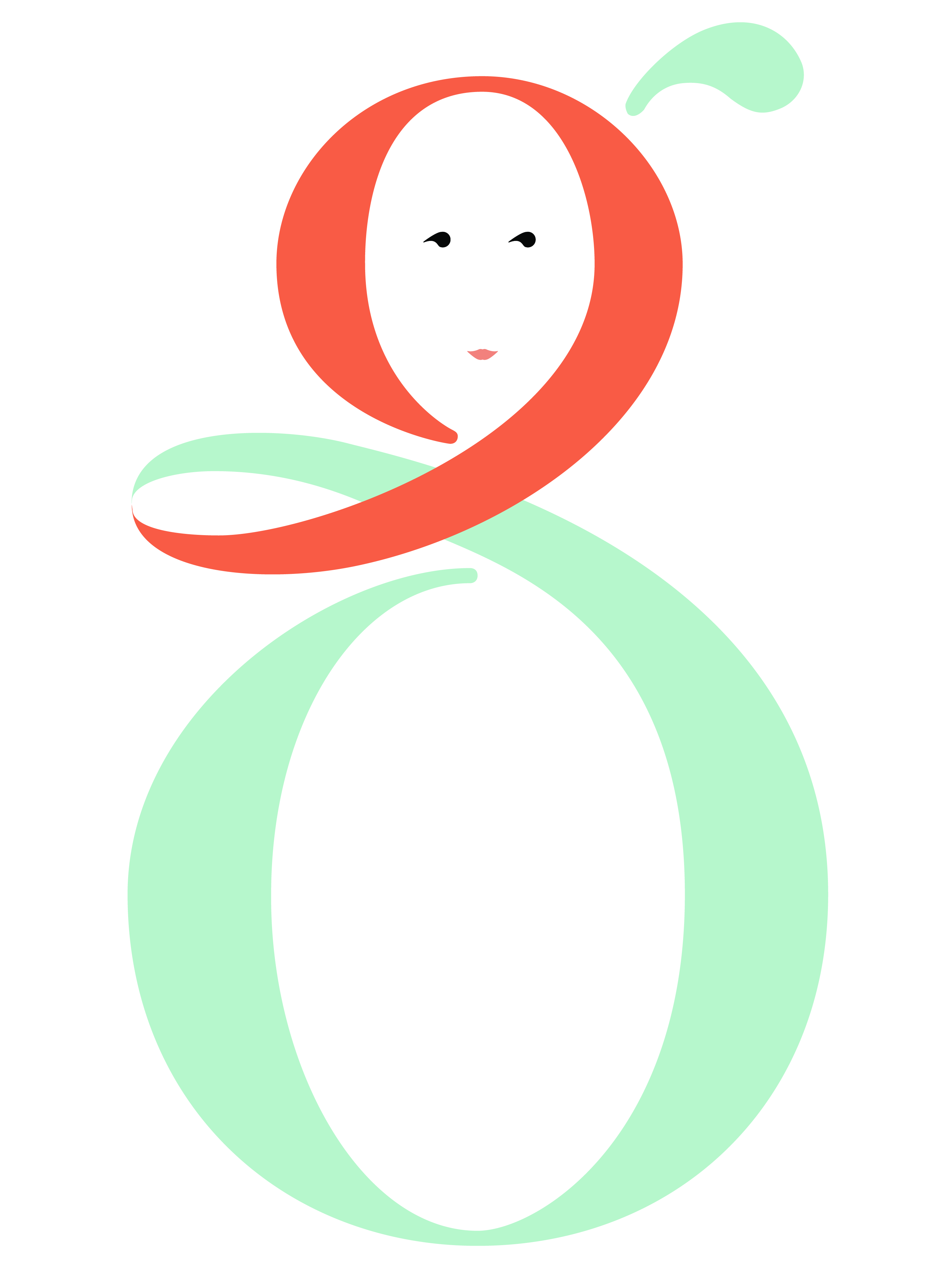
Final logo design in signature red and blue
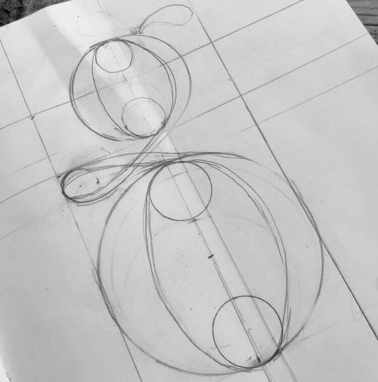
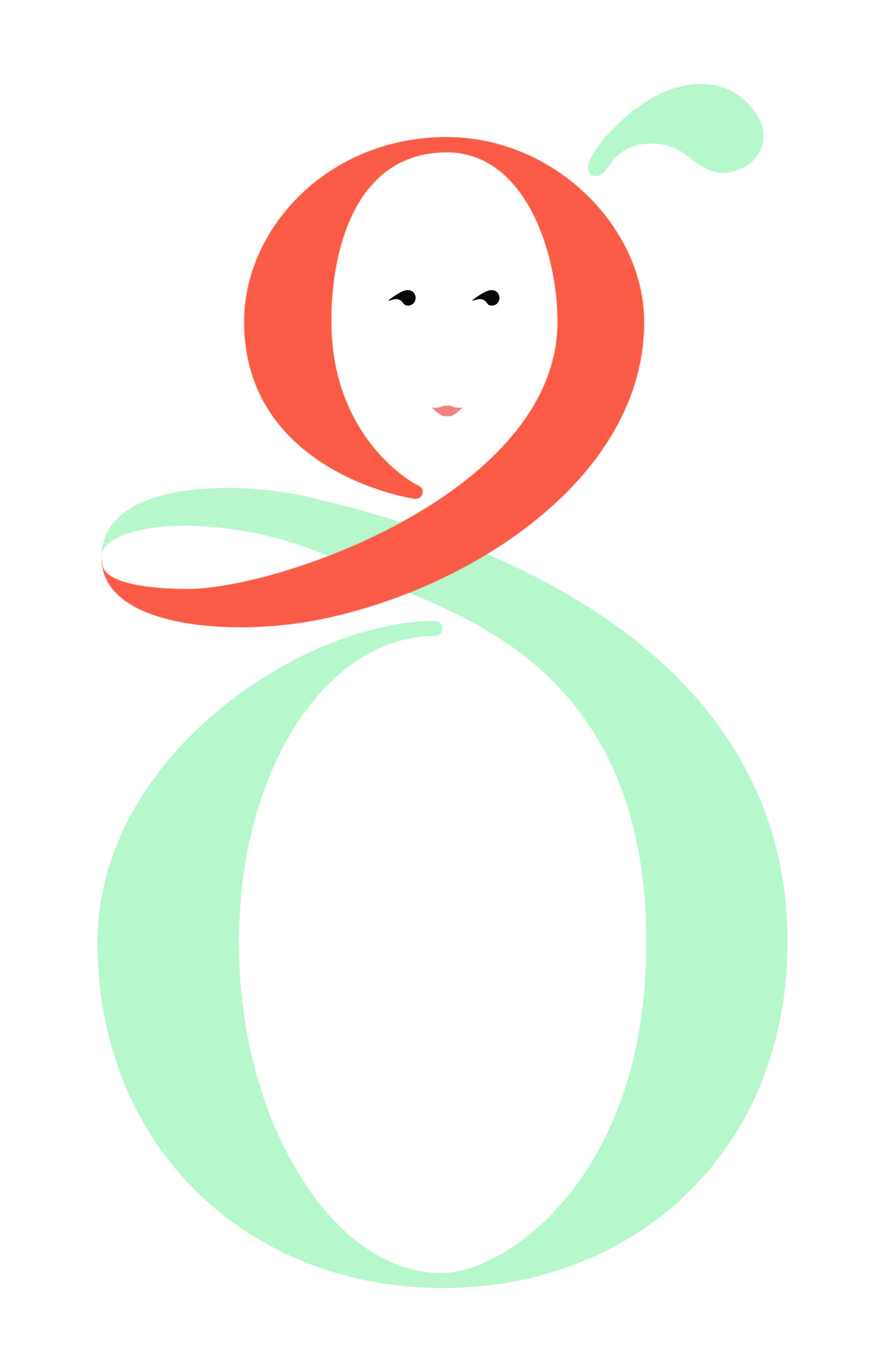
Initial sketch exploring the comma-to-scarf concept
Design Process
My sketch started out with me trying to use a comma for the curve between the bottom and the top of the g. I eventually made it into a ribbon-like scarf around the top which curves into the bottom of the character. This created a distinctive silhouette that was both elegant and playful.
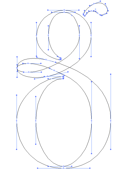
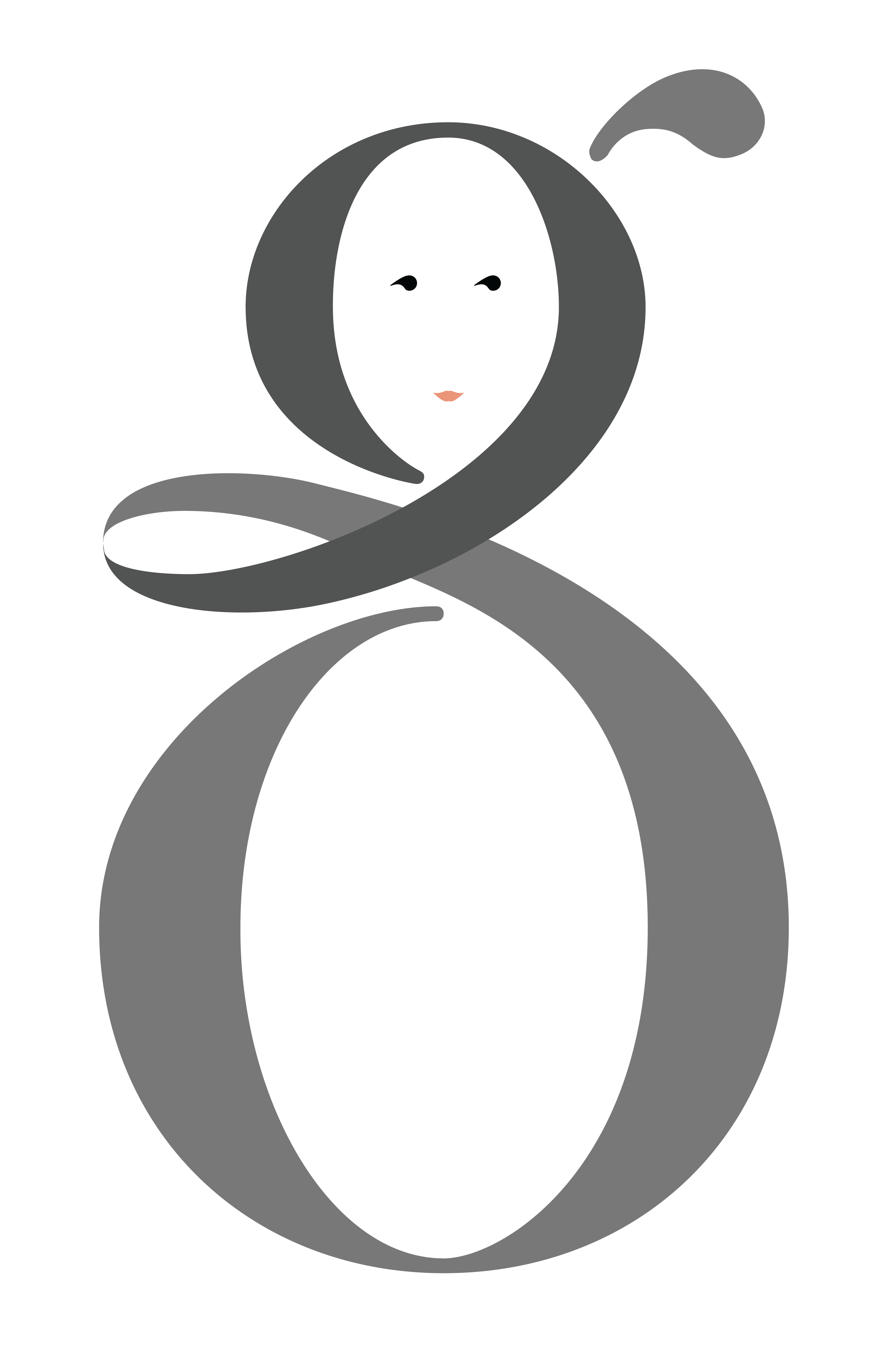
Digital construction showing anchor points and stroke weights
Digital Lettering Technique
Once in Illustrator, I traced my sketch with one line, then added end points, which gave me a guide for the thinnest sections of the character. I was finally able to finish it off by creating proportional thick vertical strokes. This technique ensured consistent stroke weights while maintaining the organic feel of hand-lettering.