March 2018
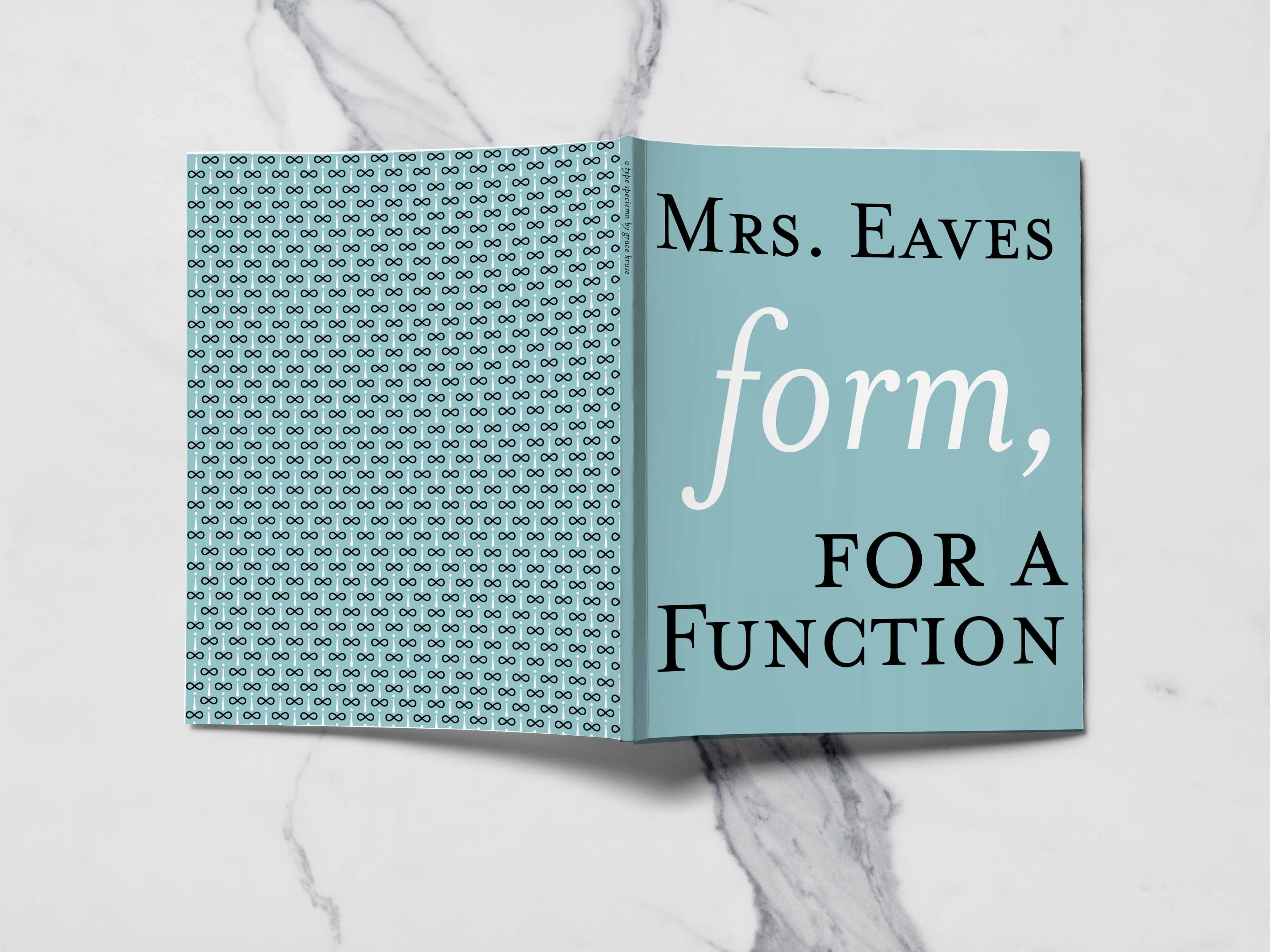
Form for a Function
A Type Specimen for Mrs. Eaves
The first time the typeface Mrs. Eaves was described to me, it was compared to a woman’s closet. Elegant, diverse, and full of accessories. That is undoubtedly true, with its flowing swashes, and extensive ligature library. Despite beautiful qualities, it is not necessarily a functional closest. It more closely resemble a closet full of heels. Although heels have a time and place to be worn, everyday errands are not the right occasion to wear them. Mrs. Eaves is the same way. It is perfect for display giving the covers of Penguin Classics, the Wordpress logo, and short quotes, an elegant persona. It is not for text in books or blogs. When designing Mrs. Eaves, Zuzana Licko created it to be light and airy, and that goal was most definitely achieved. However in doing that, you sacrifice the ability to use it as a text font. All in all, I think Mrs. Eaves is a beautiful typeface, it just has to be used at the right time, in the right place.
The theme of the type specimen is inspired by things on display. Throughout the pages, the glyphs of Mrs. Eaves are participating in a beauty contest to show off their finest features to distinguished judge Kate Middleton. Both Kate Middleton and beauty contests are often thought of as figures on display, which fit the purpose of the typeface.
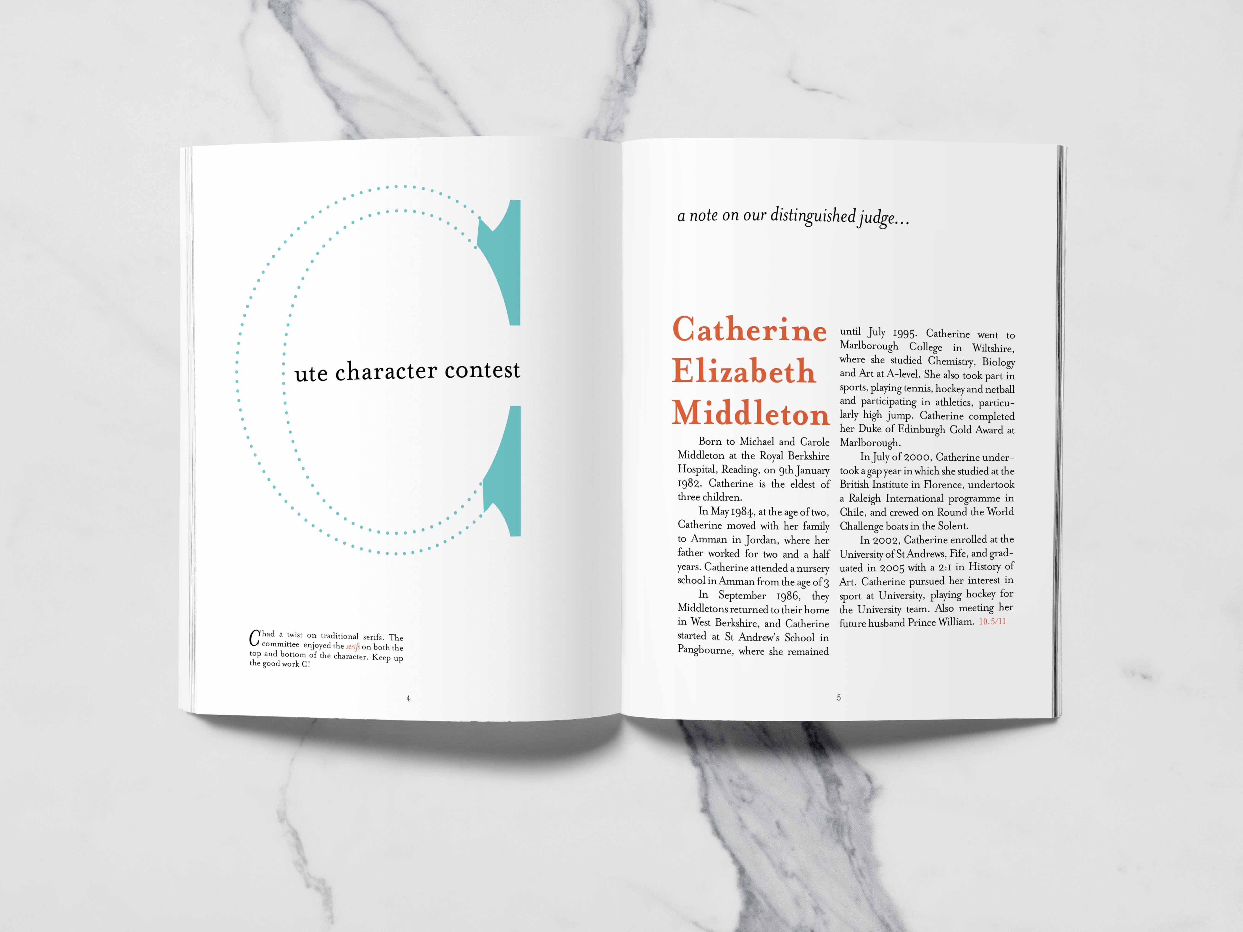
Since Mrs. Eaves is a display typeface, Kate Middleton seemed to be a good comparison. As the future Queen of England, it is her duty to always put her best foot forward despite any circumstance. Although the future of the country is not riding on her decisions, the entirety of the United Kingdom is looking at how she makes her decisions. To continue on the idea of display, the characters of Mrs. Eaves, are being showcased in beauty contest.
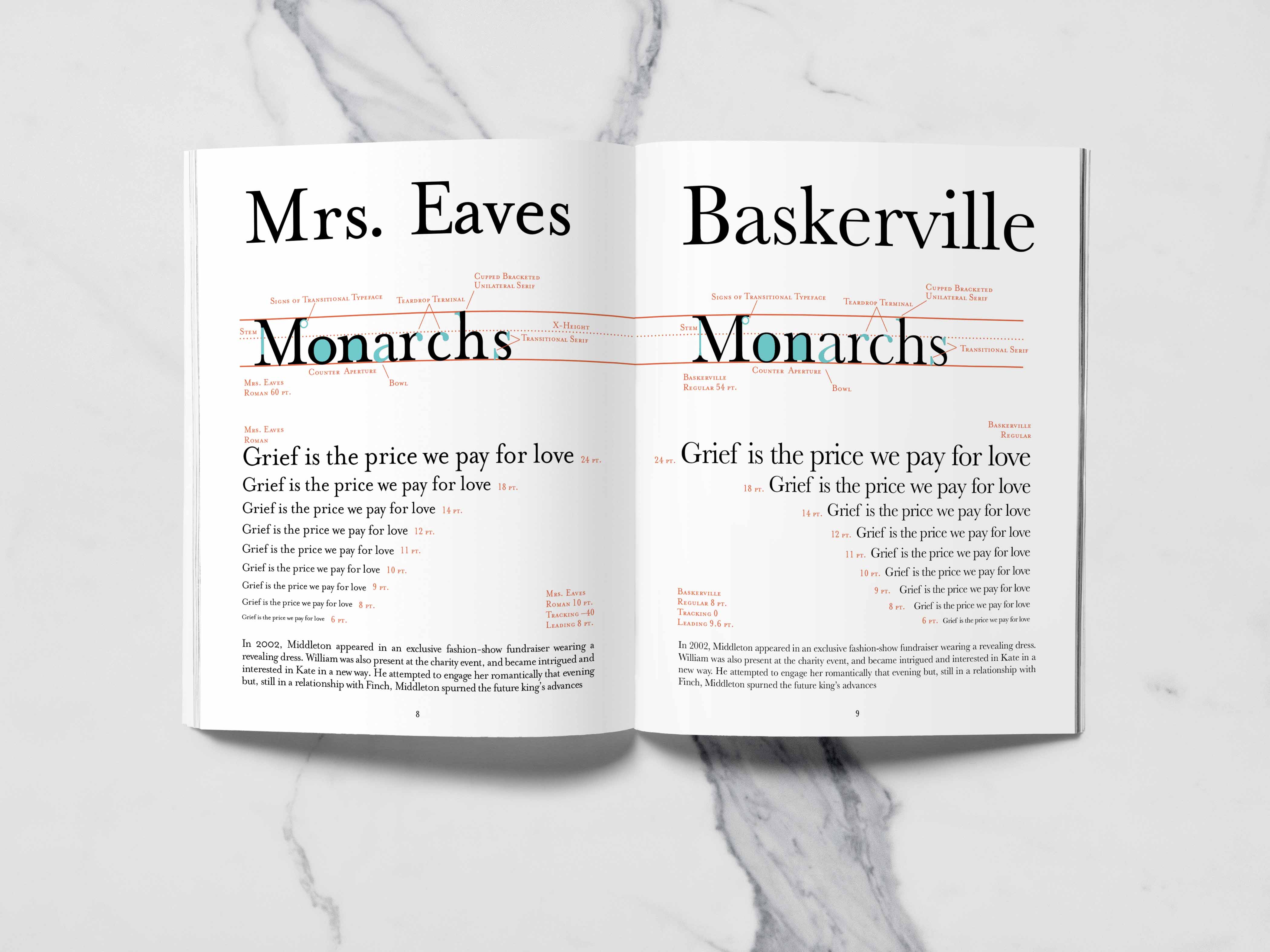
Above, our judge, Kate Middleton, explains the judging criteria and gives a background on why the contest is being hosted. She is looking for good examples of a transitional typeface as well as teardrop terminals and low x-height. She also shows how Baskerville, the predecessor of Mrs. Eaves, uses the same qualities.
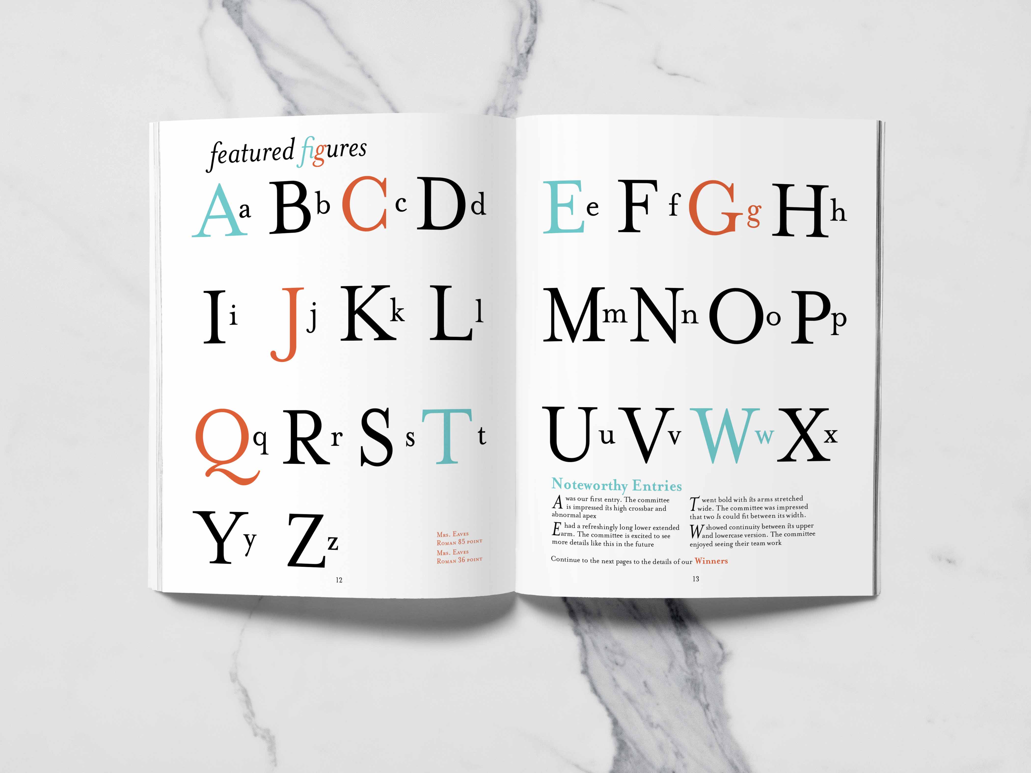
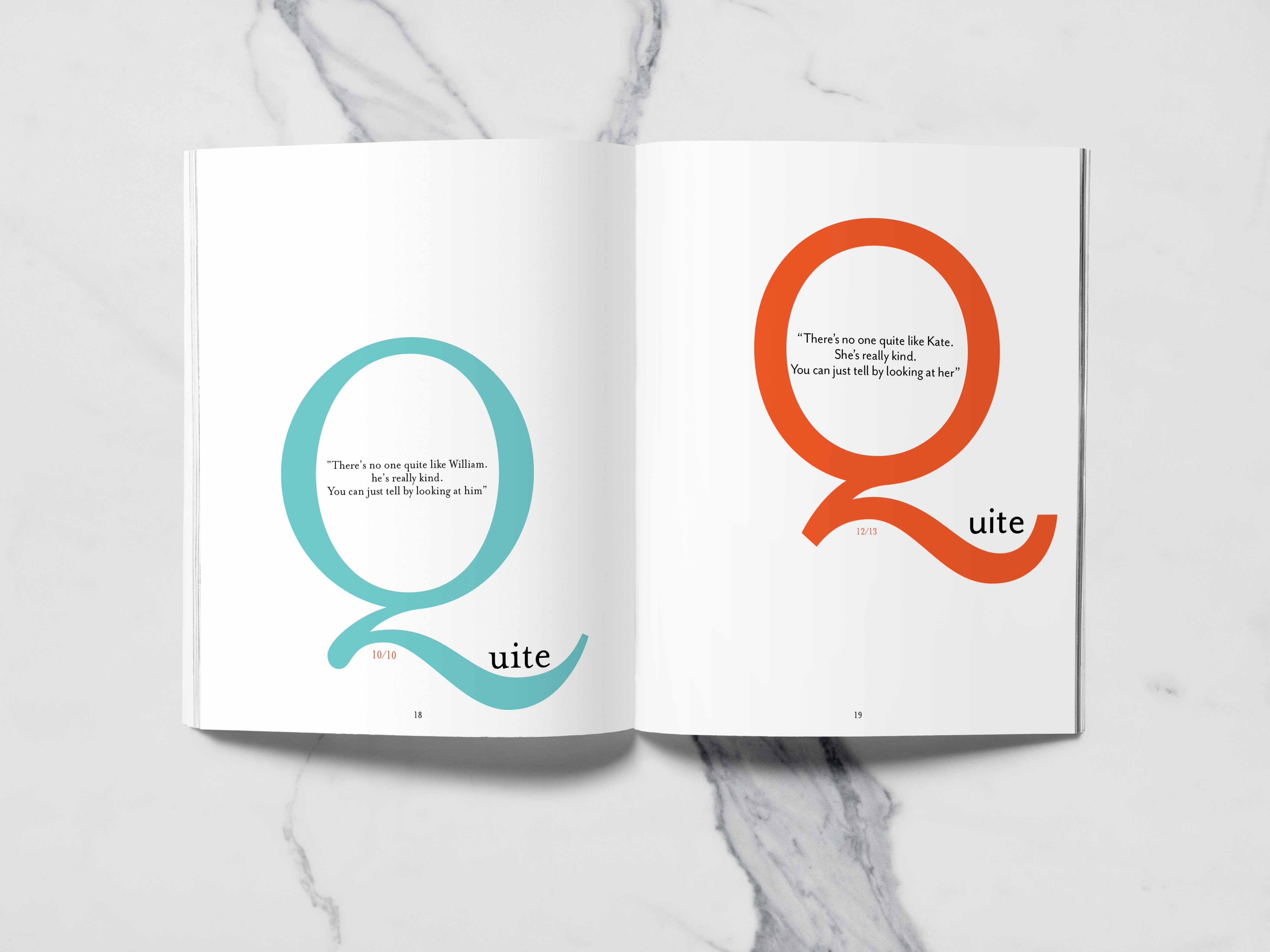
Finally, all the characters are on display. The ones in blue receive honorable mention and a short blurb about there outstanding characteristics, whereas the ones in orange, have a whole page dedicated their exquisite features.
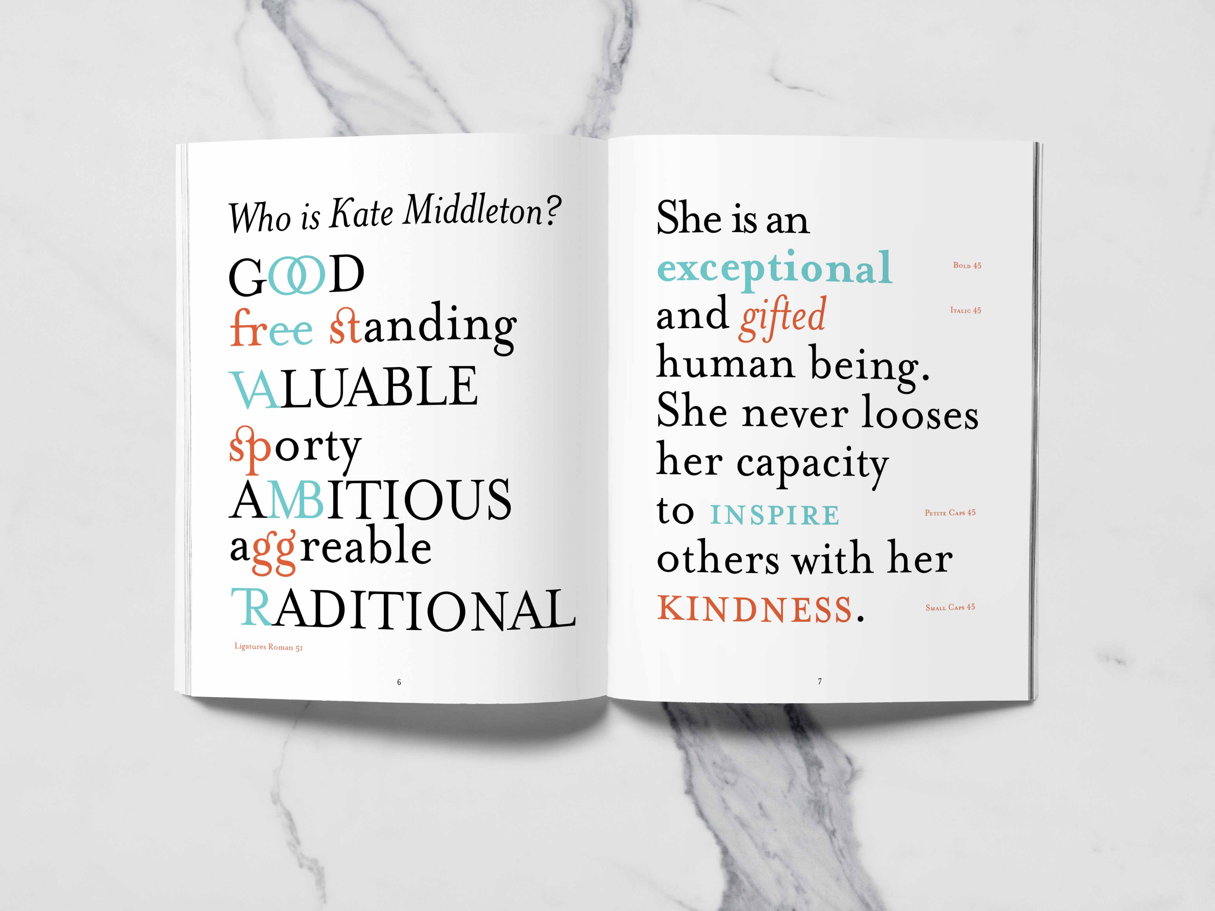
Mrs. Eaves was not just a one and done typeface. It contains an extensive ligature library, as well as being a complete typeface with bold, italic, small caps, and demi caps.
How Mrs. Eaves inspired the typeface Mr. Eaves.
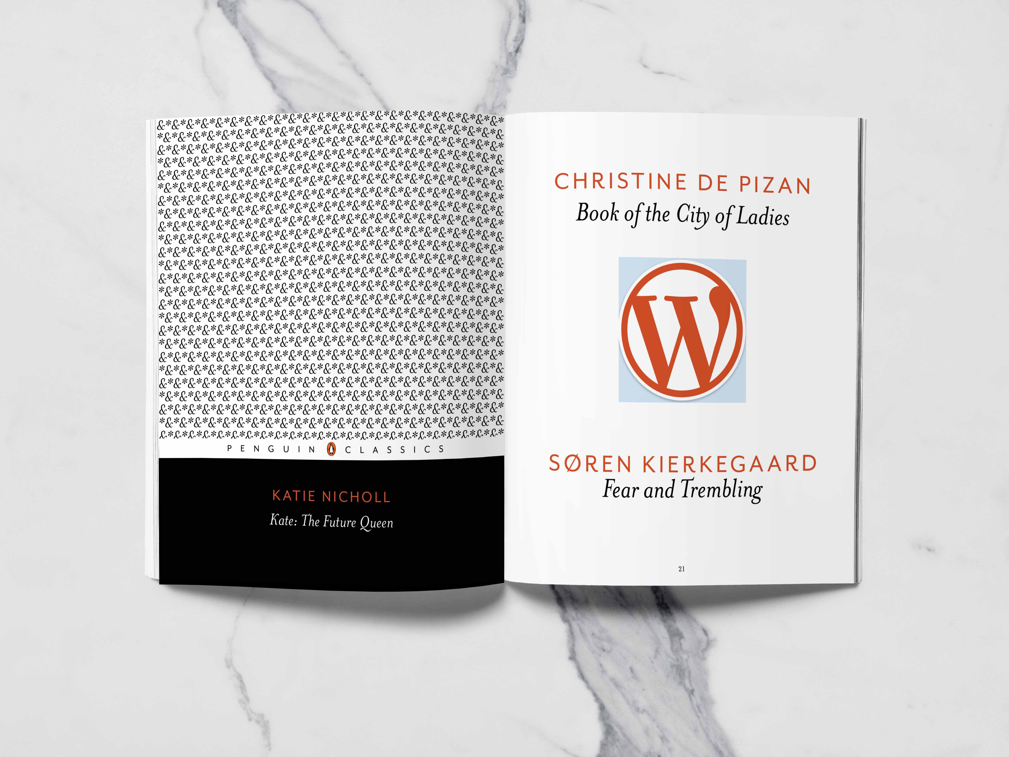
The uses for Mrs. Eaves are extensive, appearing on the cover of all Penguin Classics books and the Wordpress logo, looking elegant with a diverse range of uses. See the whole type specimen here.